

With the police reform at the forefront of the conversation for most Americans, I thought it would be interesting to look at what information regarding policing is freely available for my current city, Philadelphia.
Enter OpenDataPhilly. A great repository for information regarding Philadelphia.
The most informative datasets I found regarding policing in the city are the following:
The first dataset provides a listing of complaints against police officers linking them to their police district
The second dataset contains information and geographical location of crime incidents.
Finally the last provides the boundaries of each police district, allowing us to do some data aggregation over the district.
A great tool to do spatial analysis is Geopandas. It behaves similar to a pandas database but with some additional spatial features.
The first step is to load our different datasets into a geopandas df.
import geopandas
import pandas as pd

complaints=pd.read_csv('ppd_complaints.csv')
po_districts=geopandas.read_file("Boundaries_District.geojson")
disciplines=pd.read_csv('ppd_complaint_disciplines.csv')
inc=geopandas.read_file("../incidents_part1_part2.geojson")
To check our dataset we can plot it.
po_districts.plot()
In order to simplify the analysis we do some cleanup of the data
complaint_date=complaints.reset_index().set_index('complaint_id')['date_received'].to_dict()

disciplines['date_recieved']=disciplines.complaint_id.map(complaint_date)

disciplines['district_num']=pd.to_numeric(disciplines.po_assigned_unit.dropna().apply(lambda x: x.split(' ')[0][:2]),errors='coerce')
Now there are a couple of different aspects we would want to check for the data. The first would be to determine or get a metric of how may complaints each officer has. I would assume that pretty much every officer has some. But how many is too many? Are there any particular officers or precincts that have a significantly larger amount of than their peers.
We can look at the basic stats of the complaints dataset.
complaintsbyofficer=disciplines.groupby('officer_id').complaint_id.count().sort_values(ascending=False)

complaintsbyofficer.describe().to_frame().style.format("{:.2f}")
| complaint_id | |
|---|---|
| count | 3032.00 |
| mean | 2.66 |
| std | 2.59 |
| min | 1.00 |
| 25% | 1.00 |
| 50% | 2.00 |
| 75% | 3.00 |
| max | 32.00 |
However this doesn't provide much information regarding the shape of the dataset and its outliers. Although one officer receiving 32 complaints seems high
One great way to get a quick overview of the outliers we can use a box plot. This is easy to do with seaborn.
import seaborne as sns

unit_officer=disciplines.groupby(['district_num','officer_id']).complaint_id.count().reset_index()

fig, ax = plt.subplots(1, 1,figsize=(35,10))
g=sns.boxplot(x="district_num", y="complaint_id",data=unit_officer[unit_officer['district_num'].isin(po_districts.DISTRICT_.unique())], ax=ax)
plt.xticks(rotation=90);
ax.tick_params(labelsize=24);
fig.suptitle('District Complaints/ Officer', fontsize=32);
ax.set_xlabel('District Number', fontsize=24);
ax.set_ylabel('Number of Complaints', fontsize=24);
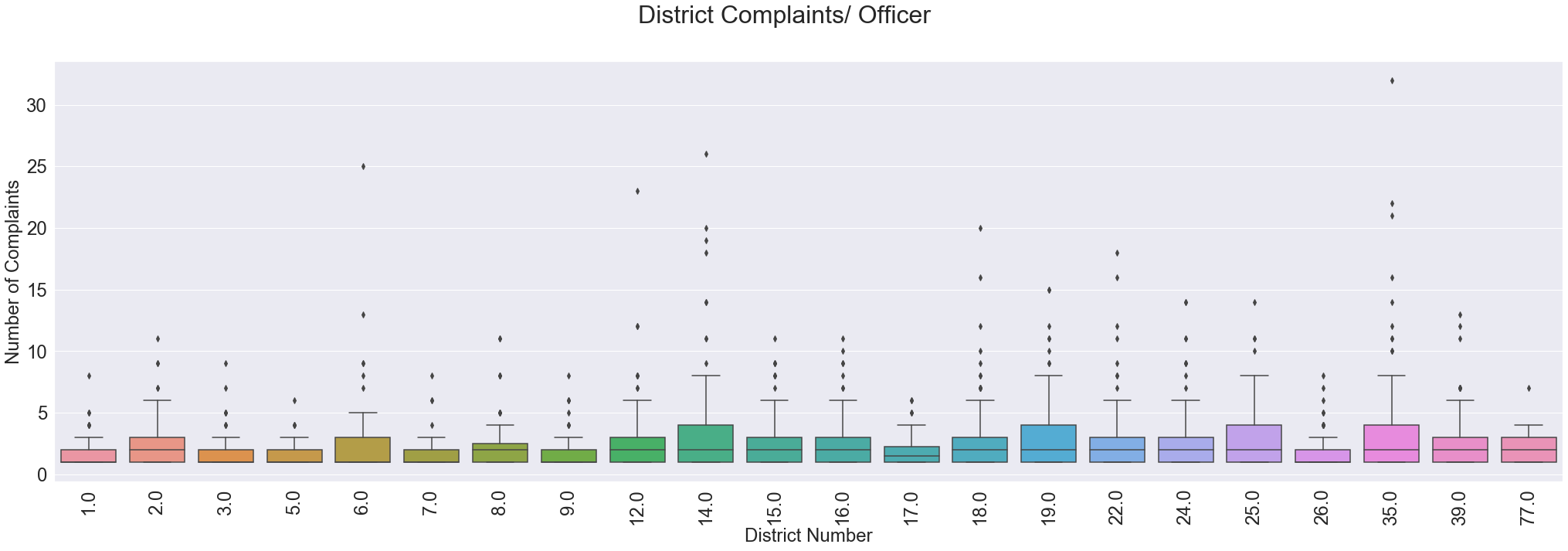
From the chart it seems that district 14 and district 35 have a significantly amount of officers that receive more complaints than their peers.
While we are at it we can pull out the outliers per category using the following.
outlier_officers=[]
for c, g in unit_officer.reset_index().groupby('district_num'):
    stats=boxplot_stats(g.complaint_id)
    outliers = [y for stat in boxplot_stats(g['complaint_id']) for y in stat['fliers']]
    outlier_officers=np.append(outlier_officers,list(g[g['complaint_id'].isin(outliers)].officer_id.values))
Now that we have the outliers is there an easily identifiable patter for the officers, for example race.
outlier_race=disciplines[disciplines['officer_id'].isin(outlier_officers)].groupby('officer_id')['po_race'].unique()

fig, ax = plt.subplots(1, 1,figsize=(20,10))
outlier_race.apply(lambda x:x[0]).value_counts().plot(kind='bar', ax=ax);
ax.tick_params(labelsize=24)
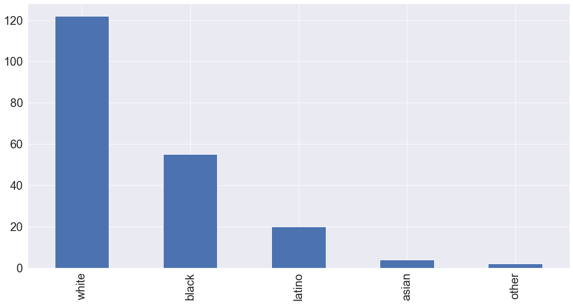
From the histogram it appears that a majority of the incidents come from police officers identified as white. However this could also just be because the majority of police officers are white.
fig, ax = plt.subplots(1, 1,figsize=(20,10))
disciplines.groupby('officer_id').po_race.unique().apply(lambda x:x[0]).value_counts().plot(kind='bar');
ax.tick_params(labelsize=24)
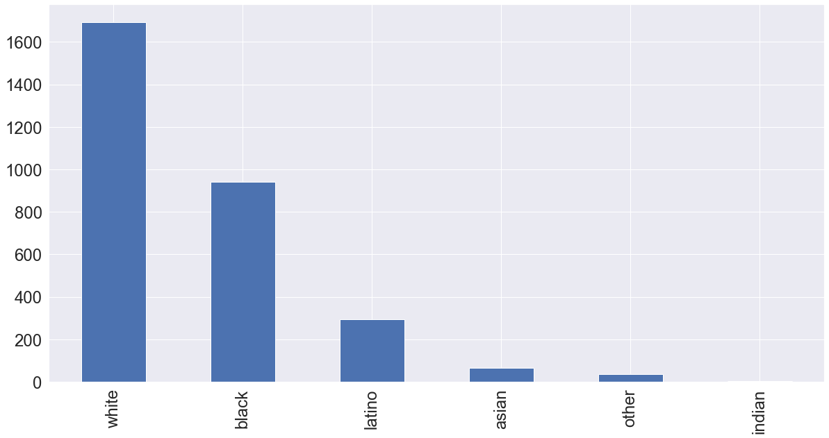
From that the histogram of the overall police officers receiving complaints we see that the outlier population seems to closely mirror the overall population so the race of the officer might not have a significant impact in whether or nor an officer receives a large amount of complaints.
Continuing with the racial information contained by the complaints we can check to see if that has an effect on the findings related to the complaints.
colors_tc=cm.Spectral(np.linspace(0, 1,len(disciplines.investigative_findings.unique()) ) )

fig, ax = plt.subplots(1, 1,figsize=(10,10))
disciplines.investigative_findings.value_counts().plot(kind='pie', ax=ax,textprops={'fontsize': 14},colors=colors_tc,wedgeprops={"edgecolor":"k",'linewidth': 1, 'antialiased': True})
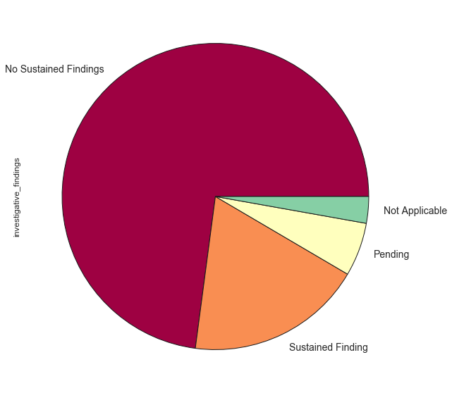
Discarding the Pending investigations it looks like overall 20-25% of complaints have resulted in sustained findings.
race_results=disciplines.groupby('po_race').investigative_findings.value_counts().to_frame()
race_results.columns=['counts']
race_results=race_results.reset_index()
r_f=race_results[~race_results.investigative_findings.isin(['Pending'])]


cdict={}
for i,c in zip(disciplines.investigative_findings.unique(), colors_tc):
    cdict[i]=c

def plt_pie(x,y,**kwargs):
    cd=[cdict[l] for l in x]
    plt.pie(y,labels=x, colors=cd,wedgeprops={"edgecolor":"k",'linewidth': 1, 'antialiased': True})

g=sns.FacetGrid(r_f,col="po_race", col_wrap=2, sharey=False,height=6)

g=(g.map(plt_pie, "investigative_findings", "counts",cdict=cdict))
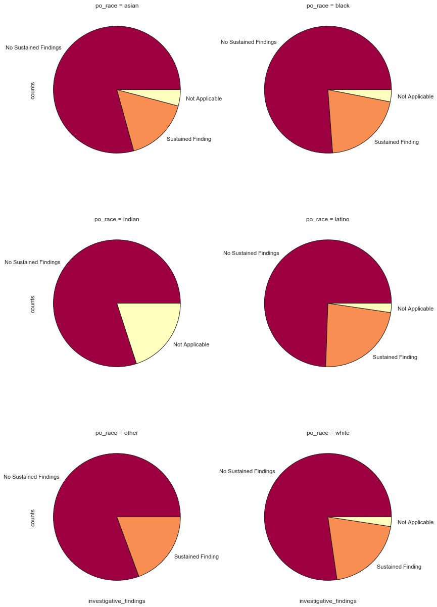
pd.pivot_table(r_f,values='counts',index=['po_race'],columns=['investigative_findings']).apply(lambda x: x / x.sum(), axis=1).fillna(0).style.format("{:.2%}")
| investigative_findings | No Sustained Findings | Not Applicable | Sustained Finding |
|---|---|---|---|
| po_race | |||
| asian | 79.29% | 4.14% | 16.57% |
| black | 76.20% | 3.07% | 20.73% |
| indian | 80.00% | 20.00% | 0.00% |
| latino | 74.45% | 2.35% | 23.20% |
| other | 80.65% | 0.00% | 19.35% |
| white | 77.30% | 2.43% | 20.26% |
It does not appear that race of the officer greatly affects the investigation results, although it does appear that Latino officers then to have more complaints sustained and officers of Asian descent have less.
In order to get a better idea of what this looks like spatially we can plot the values and show the amount of complaints by district.
In order to provide a nice basemap we use contextily and make sure we convert to the right coordinate system.
import contextily as ctx

comp_dict=disciplines.groupby('district_num').complaint_id.count().to_dict()
po_districts['comp_count']=pd.to_numeric(po_districts.DISTRICT_).apply(lambda x: comp_dict[x])

fig, ax = plt.subplots(1, 1,figsize=(30,30))
po_districts.to_crs(epsg=3857).plot(column='comp_count',cmap='YlOrRd',legend=True, ax=ax, alpha=0.5)
po_districts.to_crs(epsg=3857).boundary.plot(ax=ax, color='k')
ctx.add_basemap(ax, source=ctx.providers.Stamen.TonerLite)

for l,name in zip(po_districts.to_crs(epsg=3857).centroid,po_districts.DISTRICT_):
    plt.text(l.x,l.y,name,ha='center', va='center',fontsize='32')

ax.set_axis_off()
ax.set_title('POLICE DISTRICT, COMPLAINT COUNTS',fontsize='56');
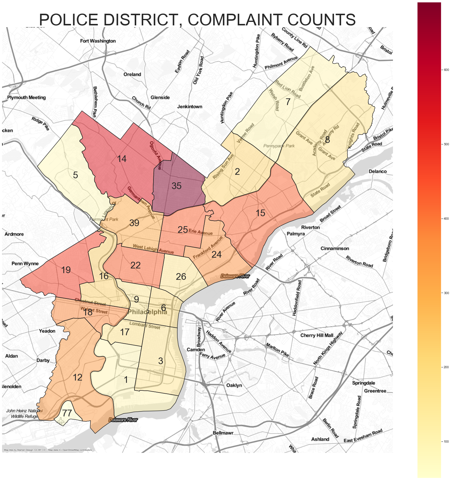
From this plot we can see that districts 14 and 35 (previously identified as having outlier officers) have a large amount of complaints.
However complaint counts by themselves don't necessarily provide us the full picture. After all there could be districts with a higher number of crime incidents leading to a higher number of complaints.
We can get a count of crime incidents per district relatively easy and use that to get a measurement of complaints per 1000 incidents. We can do so using spatial joins.
inc_in_z=geopandas.sjoin(inc,po_districts,how='inner',op='within')

inc_in_d=inc_in_z.groupby('DISTRICT_').objectid.count()

inc_in_d_dict=inc_in_d.to_dict()

po_districts['incidents']=po_districts['DISTRICT_'].apply(lambda x: inc_in_d_dict[x])

po_districts['ratio']=po_districts.apply(lambda x:(x.comp_count*1000)/x.incidents,axis=1)

ratio_dict=po_districts[['DISTRICT_','ratio']].set_index('DISTRICT_').to_dict()['ratio']

inc_in_d=inc_in_d.loc[lambda x: x.index != 77]

xmax=inc_in_d.max()
xmin=inc_in_d.min()

def scale_into_range(x,a,b,xmin,xmax):
    res=(((b-a)*(x-xmin))/(xmax-xmin))+a
    return res

inc_in_d_scale=inc_in_d.apply(lambda x: scale_into_range(x,1000,20000,xmin,xmax))
inc_in_d_scale_dict=inc_in_d_scale.to_dict()

po_districts_n=po_districts[po_districts['DISTRICT_']!=77].copy()
po_districts_n['Inc_Sc']=po_districts_n.DISTRICT_.map(inc_in_d_scale)

po_districts_n['comp_count']=pd.to_numeric(po_districts_n.DISTRICT_).apply(lambda x: comp_dict[x])

fig, ax = plt.subplots(1, 1,figsize=(30,30))
po_districts_n.to_crs(epsg=3857).plot(column='comp_count',cmap='Blues', ax=ax, alpha=0.5)

po_districts_n.to_crs(epsg=3857).boundary.plot(ax=ax, color='k')
ctx.add_basemap(ax, source=ctx.providers.Stamen.TonerLite)
plt.scatter(list(po_districts_n.to_crs(epsg=3857).centroid.x),list(po_districts_n.to_crs(epsg=3857).centroid.y),alpha=0.5,s=list(po_districts_n.Inc_Sc),c=list(po_districts_n.ratio),cmap='YlOrRd',edgecolor='k')
for l,name in zip(po_districts_n.to_crs(epsg=3857).centroid,po_districts_n.DISTRICT_):
    mlab='District: '+str(name)+'\nIncidents: '+'{:,}'.format(inc_in_d_dict[name])+'\nComplaints: '+str(comp_dict[name])
    plt.text(l.x,l.y,mlab,ha='center', va='center',fontsize='12')

axins = inset_axes(ax,
                   width="5%",  # width = 5% of parent_bbox width
                   height="100%",  # height : 50%
                   loc='lower left',
                   bbox_to_anchor=(-0.1, 0., 1, 1),
                   bbox_transform=ax.transAxes,
                   borderpad=0,
                   )

sm = plt.cm.ScalarMappable(cmap='Blues', norm=plt.Normalize(vmin=po_districts_n.comp_count.min(), vmax=po_districts_n.comp_count.max()))
cbr = fig.colorbar(sm, cax=axins,alpha=0.5)
cbr.ax.tick_params(labelsize=18)
cbr.set_label(label='Complaint Counts',fontsize=18)

axins = inset_axes(ax,
                   width="5%",  # width = 5% of parent_bbox width
                   height="100%",  # height : 50%
                   loc='lower left',
                   bbox_to_anchor=(1.1, 0., 1, 1),
                   bbox_transform=ax.transAxes,
                   borderpad=0,
                   )

sm2 = plt.cm.ScalarMappable(cmap='YlOrRd', norm=plt.Normalize(vmin=po_districts_n.ratio.min(), vmax=po_districts_n.ratio.max()))
cbr2 = fig.colorbar(sm2, cax=axins,alpha=0.5)
cbr2.ax.tick_params(labelsize=18)
cbr2.set_label(label='Complaints per 1000 Incidents',fontsize=18)

plt.text(0.8, 0.1, 'Marker Size related to Number of Incidents\n District 77 (Airport) not included',fontsize=26, horizontalalignment='center',verticalalignment='center', transform=ax.transAxes,bbox={'ec':'k','fc':'w'})
ax.set_axis_off()
ax.set_title('POLICE DISTRICT, RATIO OF COMPLAINTS PER 1000 INCIDENTS',fontsize='56')
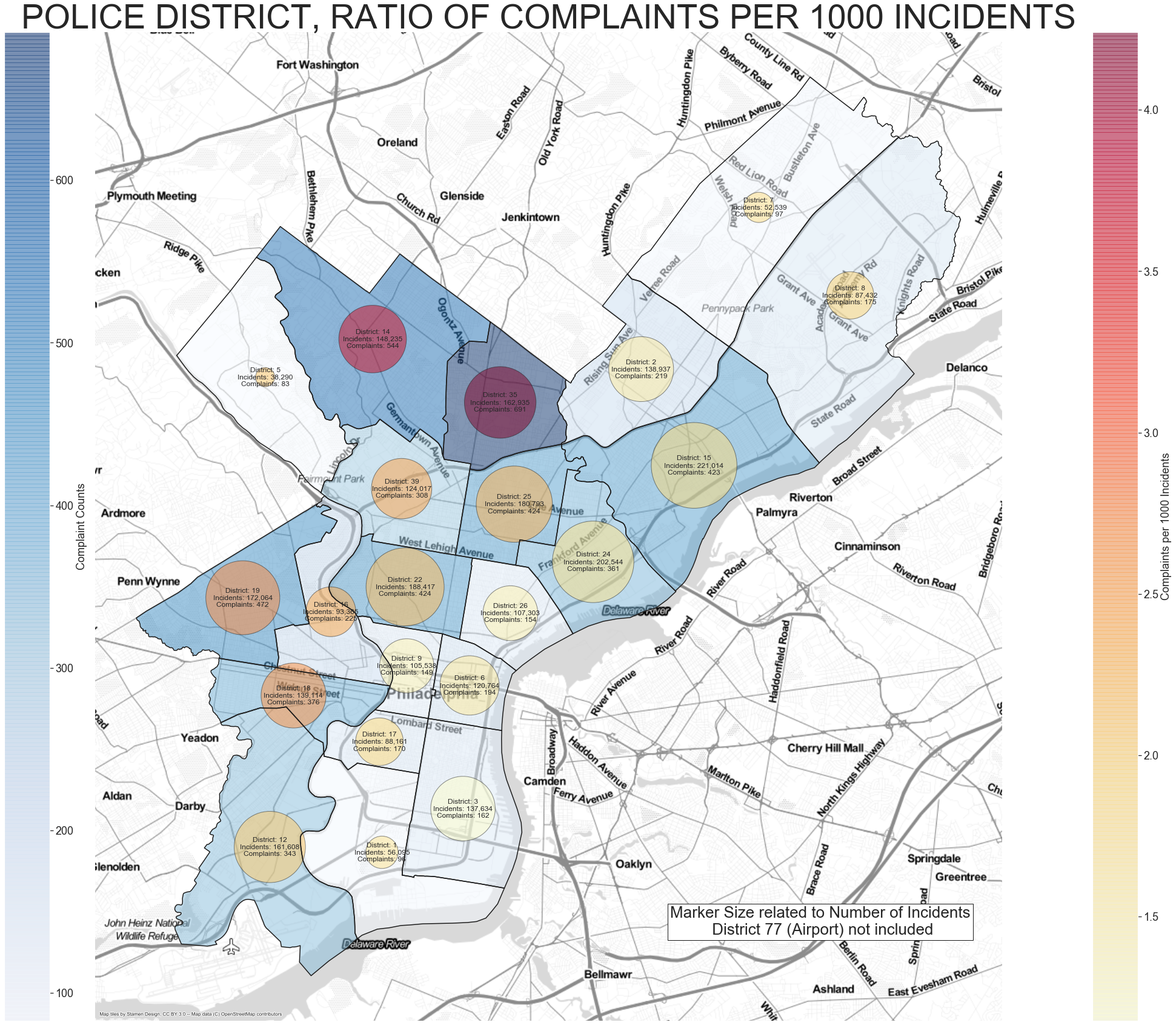
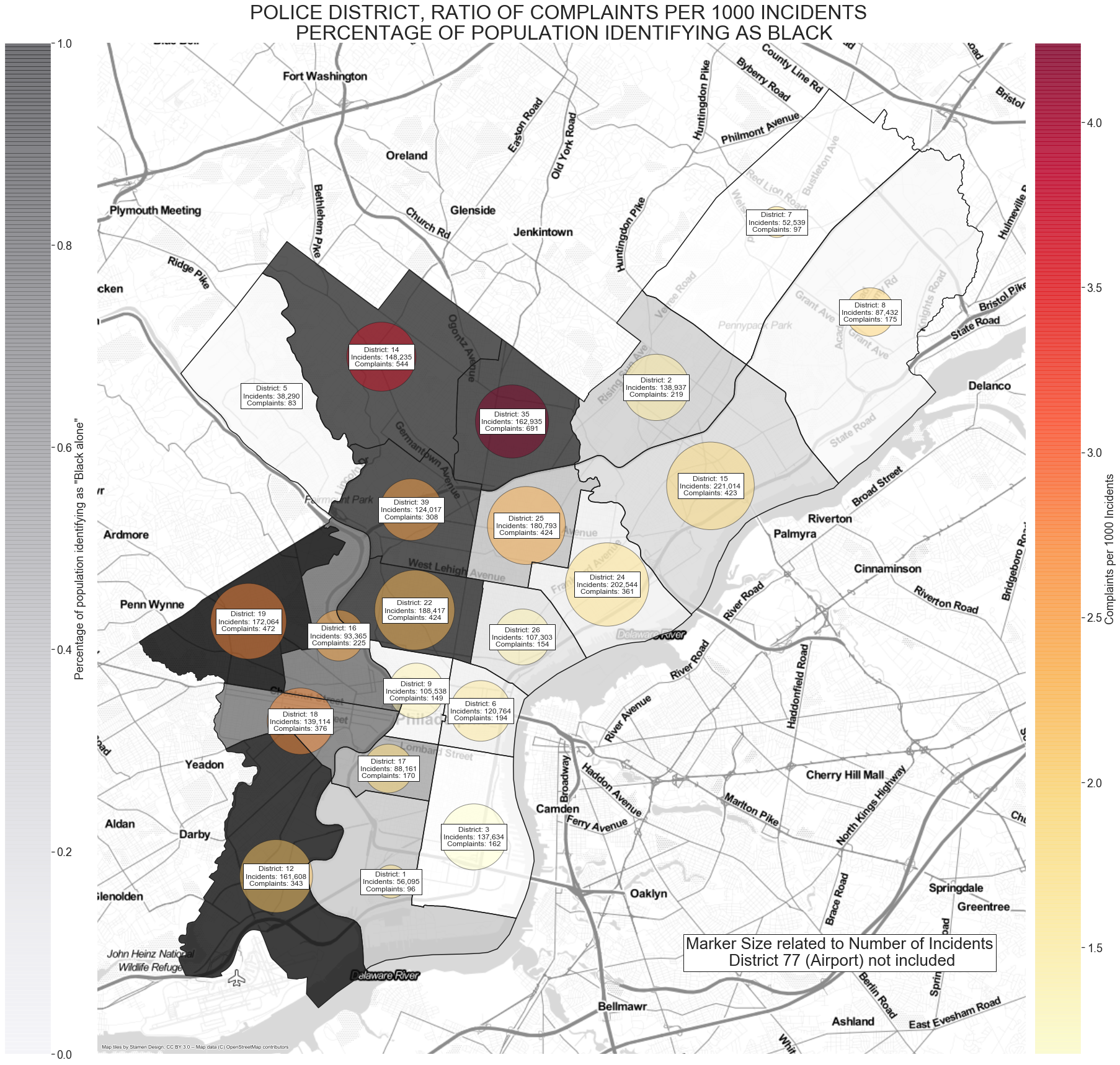
In this plot the circles correlate to number of incidents, the color of them related to the ratio of complaints to 1000 incidents. The color of the district correlated to number of complaints.
District 35 once again pops out as having a high ratio of complaints.
Perhaps this district has a large number of complaints that are found to not be valid. We can check that for all districts relatively easy.
dn_results=disciplines.groupby('district_num').investigative_findings.value_counts().to_frame()
dn_results.columns=['counts']
dn_results=dn_results.reset_index()
dn_f=dn_results[~dn_results.investigative_findings.isin(['Pending'])]

display(HTML('<h1>INVESTIGATION RESULTS PER DISTRICT</h1>'))
dn_perc=pd.pivot_table(dn_f,values='counts',index=['district_num'],columns=['investigative_findings']).apply(lambda x: x / x.sum(), axis=1)
dn_perc.loc[po_districts.DISTRICT_.unique()].sort_values('Sustained Finding',ascending=False).style.format("{:.2%}")

fig, ax = plt.subplots(1, 1,figsize=(20,10))
dn_perc.loc[po_districts.DISTRICT_.unique()].plot(kind='bar',figsize=(20,10),stacked=True,ax=ax);
ax.set_title('COMPLAINT INVESTIGATION RESULTS PER DISTRICT',fontsize='32');
ax.tick_params(labelsize=18)
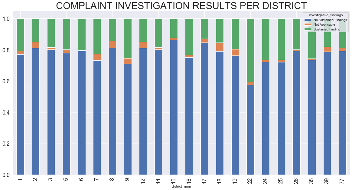
Form the resulting bar chart it does not appear that District 35 (or anyother outside of 22) have a distinctly different distribution of complaint findings.
Is there anything unique about the districts with a high ratio of complaints per 1000 incidents? One specific aspect to look at is the racial makeup of each district.
We can use the ACS Census information to obtain that information per census block and join that to the district information.
First we query the API to get the state and county codes.
state_codes=requests.get('https://api.census.gov/data/2010/dec/sf1?get=NAME&for=state:*')

state_dict={}
for x in state_codes.json()[1:]:
    state_dict[x[0]]=x[1]
state_code=state_dict['Pennsylvania']

county_codes=requests.get('https://api.census.gov/data/2010/dec/sf1?get=NAME&for=county:*&in=state:'+state_code)

county_dict={}
for x in county_codes.json()[1:]:
    county_dict[x[0]]=x[2]
county_code=county_dict['Philadelphia County, Pennsylvania']
After we get both the state code and the county information we can request the population information form the api.
census_race=requests.get('https://api.census.gov/data/2018/acs/acs5?get=group(B02001)&for=block%20group:*&in=state:'+state_code+'%20'+'county:'+county_code)

census_race_df=pd.DataFrame(census_race.json()[1:],columns=census_race.json()[0])

#We do some data cleanup there, eventually creating a key for its block number

census_race_df['bkey']=census_race_df.apply(lambda x: x['tract']+'|'+x['block group'],axis=1)
From OpenDataPhilly we also download the census block geojson and joining it with the police district with the census block info.
c_bgroup=geopandas.read_file("Census_Block_Groups_2010.geojson")
c_bgroup['bkey']=c_bgroup.TRACTCE10+['|']+c_bgroup.BLKGRPCE10
cbgroups_in_pd=geopandas.sjoin(c_bgroup,po_districts,how='inner',op='intersects')
We combine the district geojson information with the race population counts.
cb_div=cbgroups_in_pd.join(census_race_df.drop(['Geography','Total','state','county','tract','block group'], axis=1),on='bkey',how='left')
We can convert that to percentages and combine some columns and create some dictionaries for mapping to our geopandas df.
district_race_perc=cb_div[['DISTRICT_']+race_col].groupby('DISTRICT_').sum().apply(lambda x: x / x.sum(), axis=1).dropna()

cats=['White alone','Black or African American alone','Asian alone']
district_race_perc['Other']=district_race_perc.drop(cats,axis=1).sum(axis=1)

white_dict=district_race_perc['White alone'].to_dict()
black_dict=district_race_perc['Black or African American alone'].to_dict()
asian_dict=district_race_perc['Asian alone'].to_dict()
other_dict=district_race_perc['Other'].to_dict()
Now we can update our previous Philly map to include the raccial information
po_districts_n['perc_white']=pd.to_numeric(po_districts_n.DISTRICT_).map(white_dict)
po_districts_n['perc_black']=pd.to_numeric(po_districts_n.DISTRICT_).map(black_dict)
po_districts_n['perc_asian']=pd.to_numeric(po_districts_n.DISTRICT_).map(asian_dict)
po_districts_n['perc_other']=pd.to_numeric(po_districts_n.DISTRICT_).map(other_dict)

fig, ax = plt.subplots(1, 1,figsize=(30,30))
po_districts_n.to_crs(epsg=3857).plot(column='perc_black',cmap='Greys', ax=ax, alpha=0.8)

po_districts_n.to_crs(epsg=3857).boundary.plot(ax=ax, color='k')
ctx.add_basemap(ax, source=ctx.providers.Stamen.TonerLite)
plt.scatter(list(po_districts_n.to_crs(epsg=3857).centroid.x),list(po_districts_n.to_crs(epsg=3857).centroid.y),alpha=0.5,s=list(po_districts_n.Inc_Sc),c=list(po_districts_n.ratio),cmap='YlOrRd',edgecolor='k')
for l,name in zip(po_districts_n.to_crs(epsg=3857).centroid,po_districts_n.DISTRICT_):
    mlab='District: '+str(name)+'\nIncidents: '+'{:,}'.format(inc_in_d_dict[name])+'\nComplaints: '+str(comp_dict[name])
    plt.text(l.x,l.y,mlab,ha='center', va='center',fontsize='12',bbox={'ec':'k','fc':'w'})

axins = inset_axes(ax,
                   width="5%",  # width = 5% of parent_bbox width
                   height="100%",  # height : 50%
                   loc='lower left',
                   bbox_to_anchor=(-0.1, 0., 1, 1),
                   bbox_transform=ax.transAxes,
                   borderpad=0,
                   )

sm = plt.cm.ScalarMappable(cmap='Greys', norm=plt.Normalize(vmin=0.0, vmax=1))
cbr = fig.colorbar(sm, cax=axins,alpha=0.5)
cbr.ax.tick_params(labelsize=18)
cbr.set_label(label='Percentage of population identifying as "Black alone"',fontsize=18)

axins = inset_axes(ax,
                   width="5%",  # width = 5% of parent_bbox width
                   height="100%",  # height : 50%
                   loc='lower left',
                   bbox_to_anchor=(1.01, 0., 1, 1),
                   bbox_transform=ax.transAxes,
                   borderpad=0,
                   )

sm2 = plt.cm.ScalarMappable(cmap='YlOrRd', norm=plt.Normalize(vmin=po_districts_n.ratio.min(), vmax=po_districts_n.ratio.max()))
cbr2 = fig.colorbar(sm2, cax=axins,alpha=0.8)
cbr2.ax.tick_params(labelsize=18)
cbr2.set_label(label='Complaints per 1000 Incidents',fontsize=18)

plt.text(0.8, 0.1, 'Marker Size related to Number of Incidents\n District 77 (Airport) not included',fontsize=26, horizontalalignment='center',verticalalignment='center', transform=ax.transAxes,bbox={'ec':'k','fc':'w'})
ax.set_axis_off()
ax.set_title('POLICE DISTRICT, RATIO OF COMPLAINTS PER 1000 INCIDENTS \n PERCENTAGE OF POPULATION IDENTIFYING AS BLACK',fontsize='32')
plt.savefig('PHL_MAP')
| DISTRICT_ | perc_white | perc_black | perc_asian | perc_other | ratio | incidents | comp_count |
|---|---|---|---|---|---|---|---|
| 35 | 9.47% | 72.70% | 6.75% | 11.07% | 4.24 | 162,935 | 691 |
| 14 | 18.56% | 71.66% | 1.53% | 8.25% | 3.67 | 148,235 | 544 |
| 19 | 9.10% | 83.63% | 2.18% | 5.10% | 2.74 | 172,064 | 472 |
| 18 | 27.47% | 55.67% | 8.59% | 8.27% | 2.70 | 139,114 | 376 |
| 39 | 17.27% | 72.65% | 2.60% | 7.49% | 2.48 | 124,017 | 308 |
| 16 | 24.80% | 58.36% | 8.34% | 8.49% | 2.41 | 93,365 | 225 |
| 25 | 27.44% | 36.08% | 3.20% | 33.29% | 2.35 | 180,793 | 424 |
| 22 | 16.45% | 73.79% | 3.47% | 6.28% | 2.25 | 188,417 | 424 |
| 5 | 77.79% | 11.94% | 2.59% | 7.68% | 2.17 | 38,290 | 83 |
| 12 | 9.41% | 79.83% | 3.60% | 7.17% | 2.12 | 161,608 | 343 |
| 8 | 73.46% | 12.05% | 6.15% | 8.34% | 2.00 | 87,432 | 175 |
| 17 | 43.36% | 42.48% | 6.97% | 7.19% | 1.93 | 88,161 | 170 |
| 15 | 48.66% | 27.28% | 6.04% | 18.03% | 1.91 | 221,014 | 423 |
| 7 | 69.76% | 8.96% | 13.20% | 8.09% | 1.85 | 52,539 | 97 |
| 24 | 50.09% | 18.11% | 3.02% | 28.77% | 1.78 | 202,544 | 361 |
| 1 | 49.57% | 33.19% | 11.54% | 5.69% | 1.71 | 56,095 | 96 |
| 6 | 62.55% | 17.34% | 11.86% | 8.25% | 1.61 | 120,764 | 194 |
| 2 | 38.41% | 31.33% | 13.25% | 17.01% | 1.58 | 138,937 | 219 |
| 26 | 52.46% | 23.23% | 5.21% | 19.10% | 1.44 | 107,303 | 154 |
| 9 | 66.21% | 14.37% | 10.82% | 8.60% | 1.41 | 105,538 | 149 |
| 3 | 66.54% | 8.44% | 16.32% | 8.69% | 1.18 | 137,634 | 162 |
It appears that there is a significant correlation between both the location of the neighborhood (north side Philly), racial composition of the district and the ratio of complaints to incidents. Mainly it does seem significant that the districts with a majority of black population seemed to have more complaints per each incident and should be further investigated to identify driving factors.
The Jupyter notebook used to run the analysis is located at my github.